Sela Rebranding
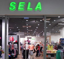
SELA, a popular Russian clothing brand, is changing its image!
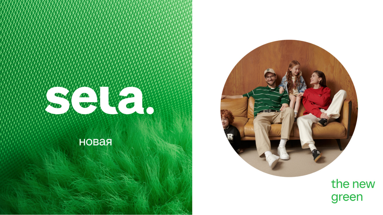
The new logo, more concise and expressive, reflects the transformation of SELA into a family lifestyle brand.
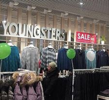
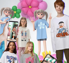
The rejection of the "moms & monsters" symbolises the expansion of the range: now SELA offers clothes not only for women, but also for men and children from 0 to 14 years old.
The key element of the new logo is a circle. It symbolizes unity, integrity, family circle, friendship, trust and care for the planet. By preserving the recognizable green color, SELA has made it more saturated and expressive. The new identity, developed by SELA's own creative team, preserves the continuity of the brand, but at the same time adds new meanings and is suitable for all customers: women, men and children.
The updated logo can already be seen on SELA's website and social networks, and in the third quarter of 2024 it will appear in an advertising campaign and on store signs.
The first SELA with a new logo will open at the end of June at the Leto shopping center in St. Petersburg
Do you want to keep up to date with the main events in the fashion industry and brand news?